
A tool for converting images to ASCII animation
Regular ASCII art loses a lot of detail. But in animation, each subsequent frame corrects errors from previous frames — and the image ends up much more detailed.
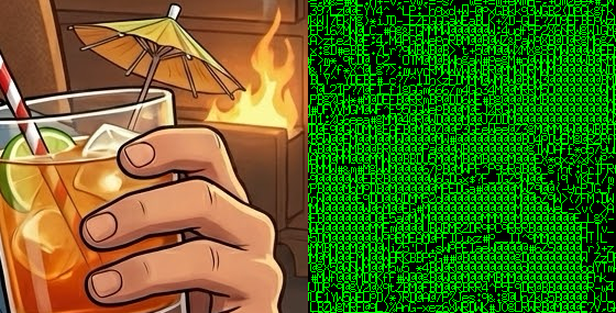
Just look at the difference between a static image and an animation. In the image from left to right: original, a single ASCII art frame (optimized by brightness PSNR), a single frame from the animation, and the full animation. It's impressive how close the animated image is to the original and how accurately it captures all the details. You simply can't get this level of detail with static ASCII art.
Interestingly, while working on the project I added a ton of features. I had gradient optimization, brightness optimization; error calculation via PSNR, SSIM, and more. I tried adding adaptive parameter selection because there were large brightness jumps that varied depending on the error metric. I experimented with different fonts, with and without antialiasing. I tried the Ukrainian and Japanese alphabets. Japanese characters are denser, and they give off that Matrix vibe — goes well with the green color.
And you know what, almost none of that made it into the release version. Because none of it produced any meaningful result. At all. Sure, the metrics showed improvement, but the difference was imperceptible to the eye, while in many cases the result got dramatically worse — plus it would have complicated the user interface. So all of that is gone.
In the end I kept just two options: character spacing and frame offset.
Character spacing
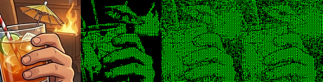
On the left — no spacing between characters; on the right — one-pixel spacing. First row: no animation. Second row: with tiling. Third row: without tiling.
I kept character spacing configurable because not everyone will like ASCII art without spacing between characters. But it looks significantly better without spacing — because the characters are quite sparse, and it's hard to achieve normal brightness when most pixels are nearly black most of the time.
Frame offset or tiling
If you shift each subsequent frame relative to the previous one, the animation can achieve a more evenly distributed error per pixel. Because pixels in characters are, of course, not evenly distributed. Look at the last row of the animation above. Without tiling the result is still worse. But if someone wants it — welcome.
Optimization metric and selection algorithm
If anyone's curious, I use brute force: I simply iterate over every character and pick the best one according to the metric. The metric is per-pixel PSNR of brightness. Errors from all previous frames are added to the current one, so for example a gray area will be bright in roughly half the frames and dark in the other half.
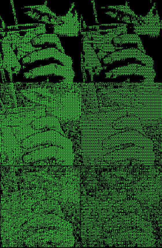
One big drawback is that it doesn't account for gradients, and the generator is completely colorblind. Two different colors of the same brightness will be rendered identically. For good results you need a source image with strong contrast, like in my examples — everything is outlined with black borders. Although it's not strictly required.
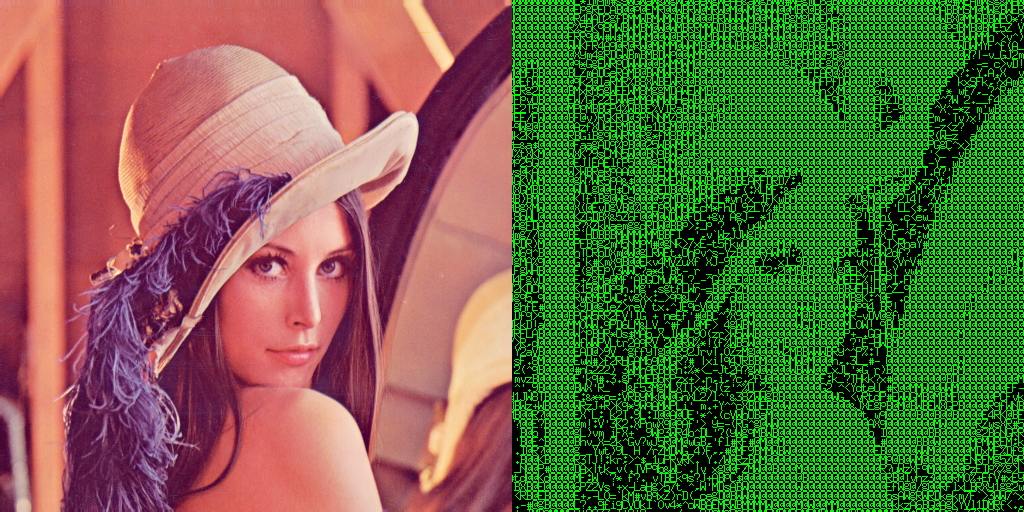
Here's an example with a photograph. The hair all blends together because it's dark with low contrast, but the feathers come out wonderfully detailed because there's enough contrast.
Comments